Rodera
used cars, in plain sight
Overview
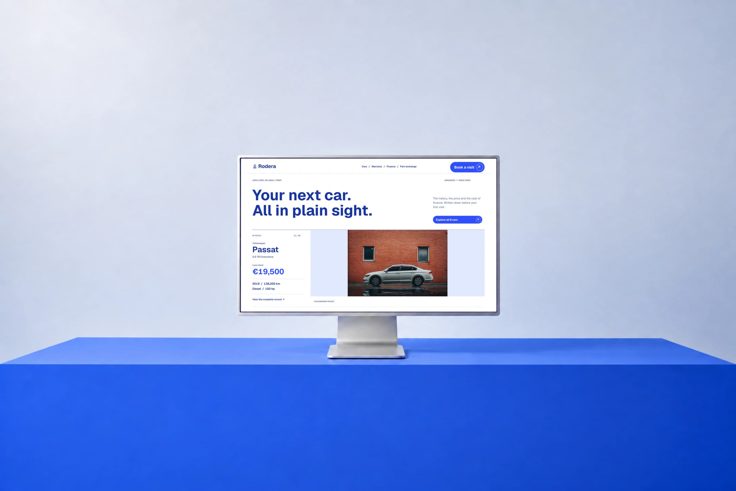
An editorial website for used cars, built around blue, bold typography and complete vehicle records. Price, history and finance share the same visual hierarchy.
Nothing saved for the phone call
Rodera is a conceptual website for a fictional used-car dealership. Its premise is simple: the price, the history and the cost of financing should be visible before someone asks to see the vehicle.
The project brings together art direction, interface design and frontend development across the homepage, catalogue, vehicle details, warranty, finance, part exchange and contact. The dealership and inventory are demonstration content, not a commercial commission or cars offered for sale.
A stronger voice, without a luxury showroom
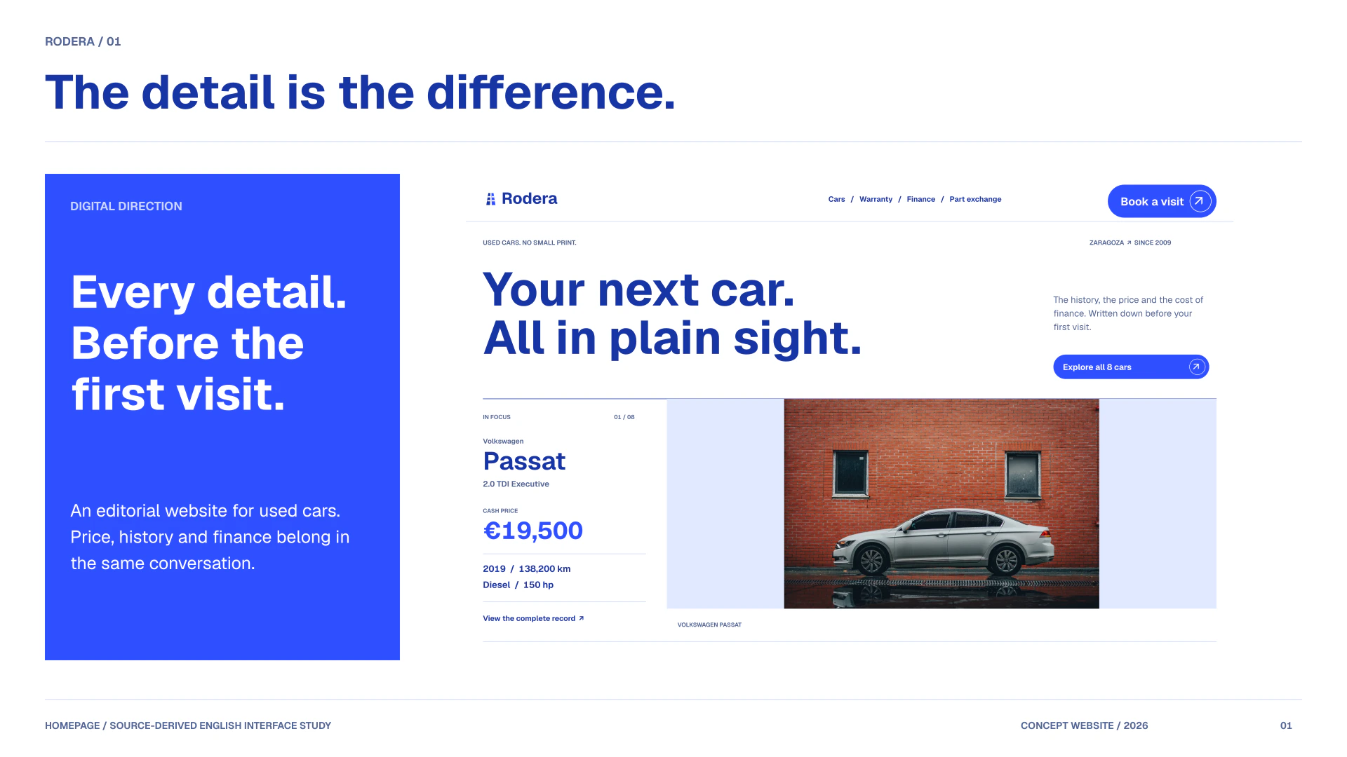
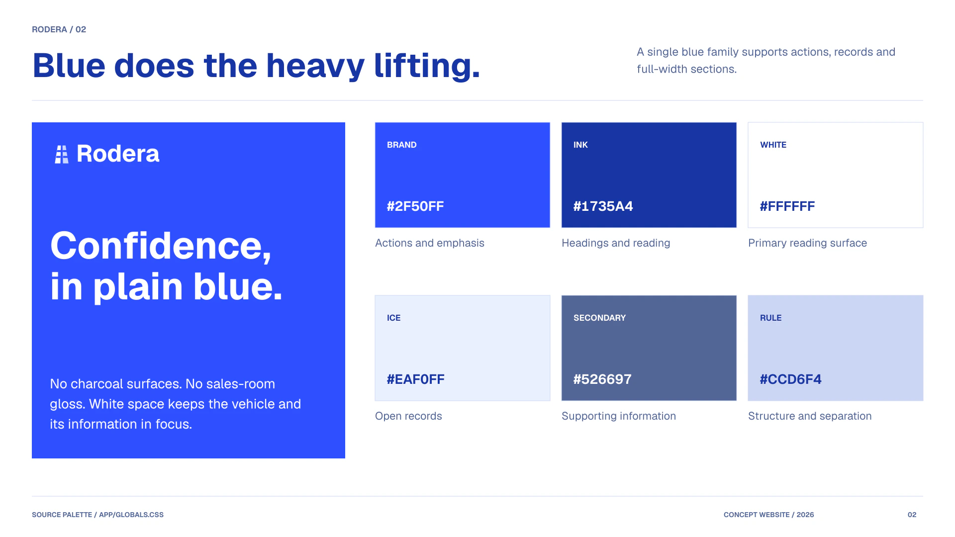
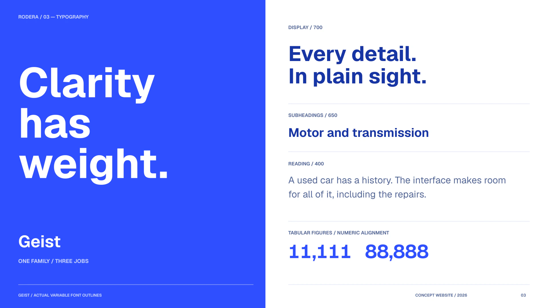
Electric blue replaces the dark surfaces. White and pale-blue areas keep the page open, while Geist uses deliberate weights: 700 for headlines, 650 for supporting headings and 400 for reading. Tabular figures give prices and specifications a consistent rhythm.
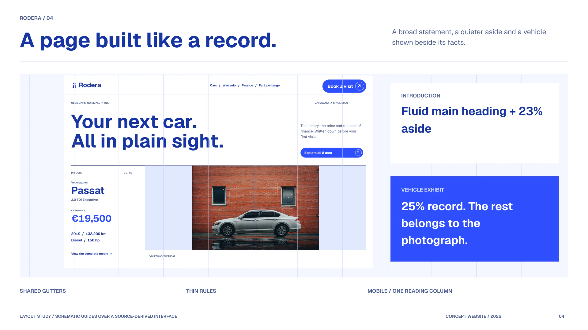
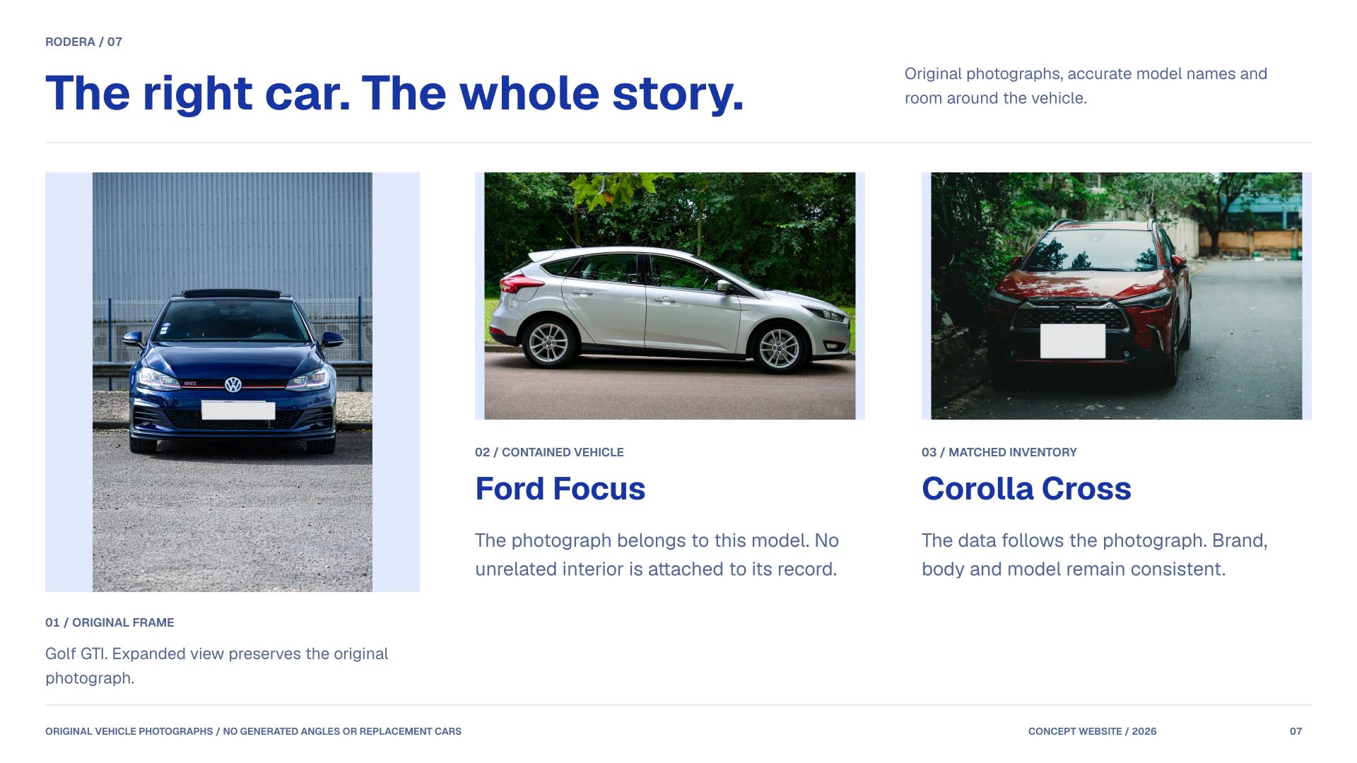
The redesigned navigation, numbered sections and thin dividers carry the same language from the homepage to every vehicle record. Photography remains tied to the actual model shown: no unrelated interiors or generated angles are added to make an incomplete gallery look complete.
The system behind the records
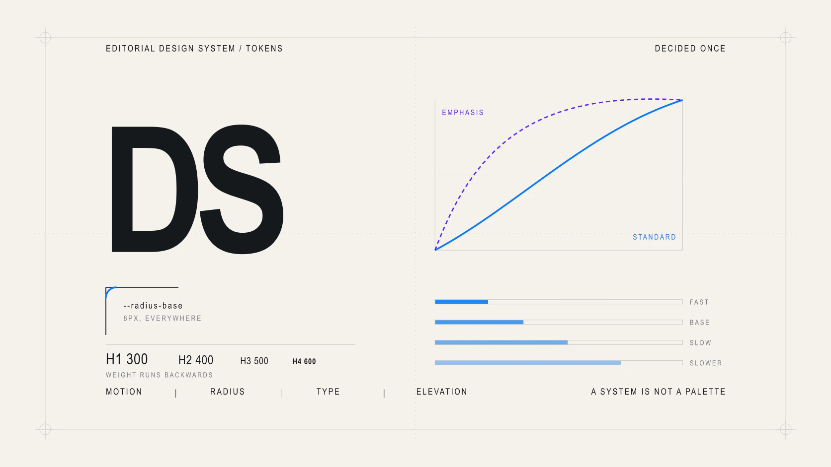
Seven design plates: palette, typography, layout, components, information design, photography and motion. Together with the three interface studies, they form a 70/30 presentation focused on design.
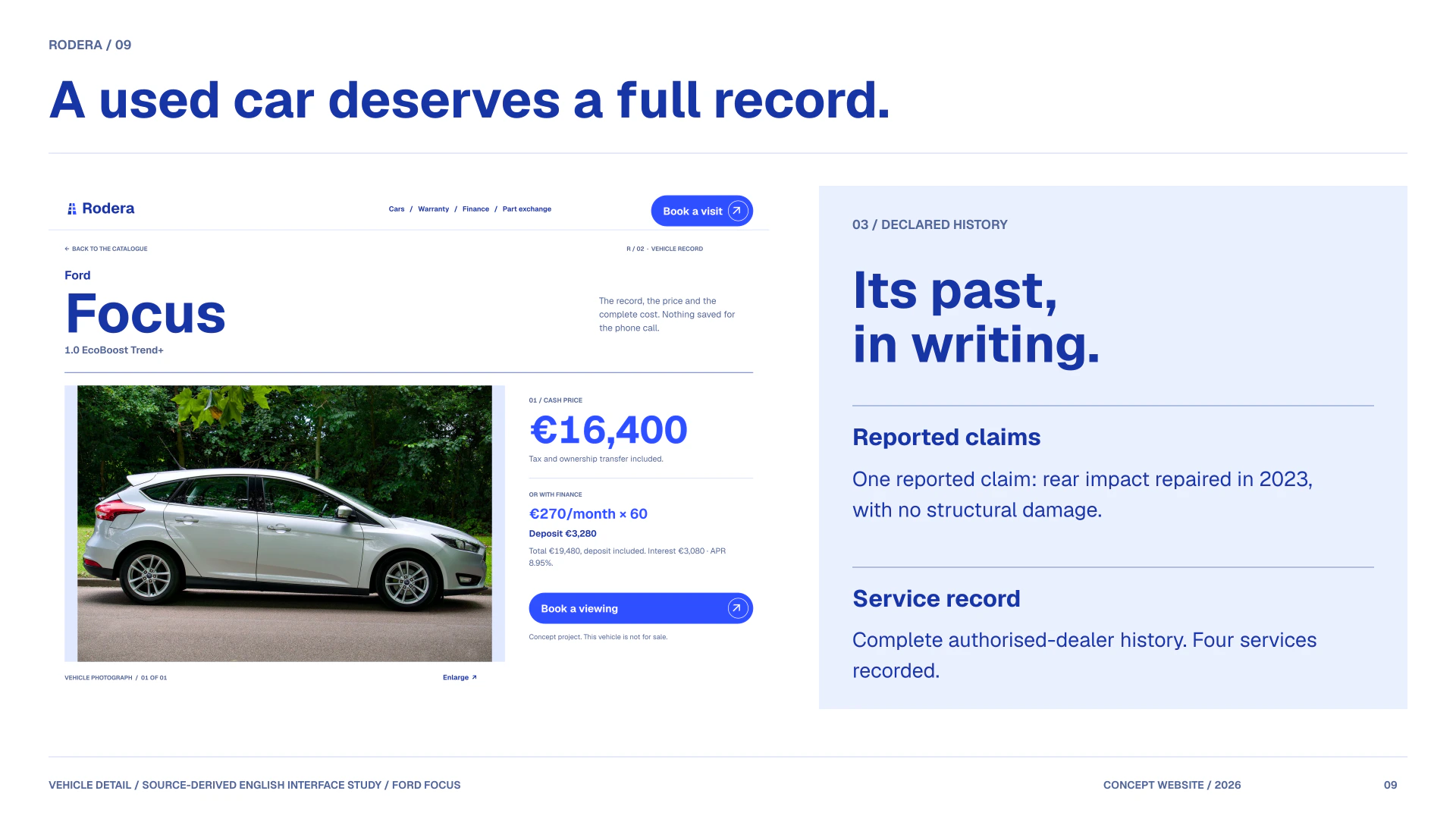
A vehicle page in the order of a decision
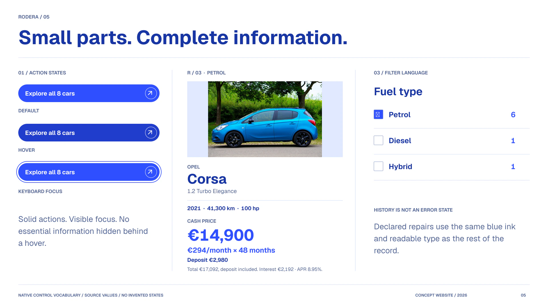
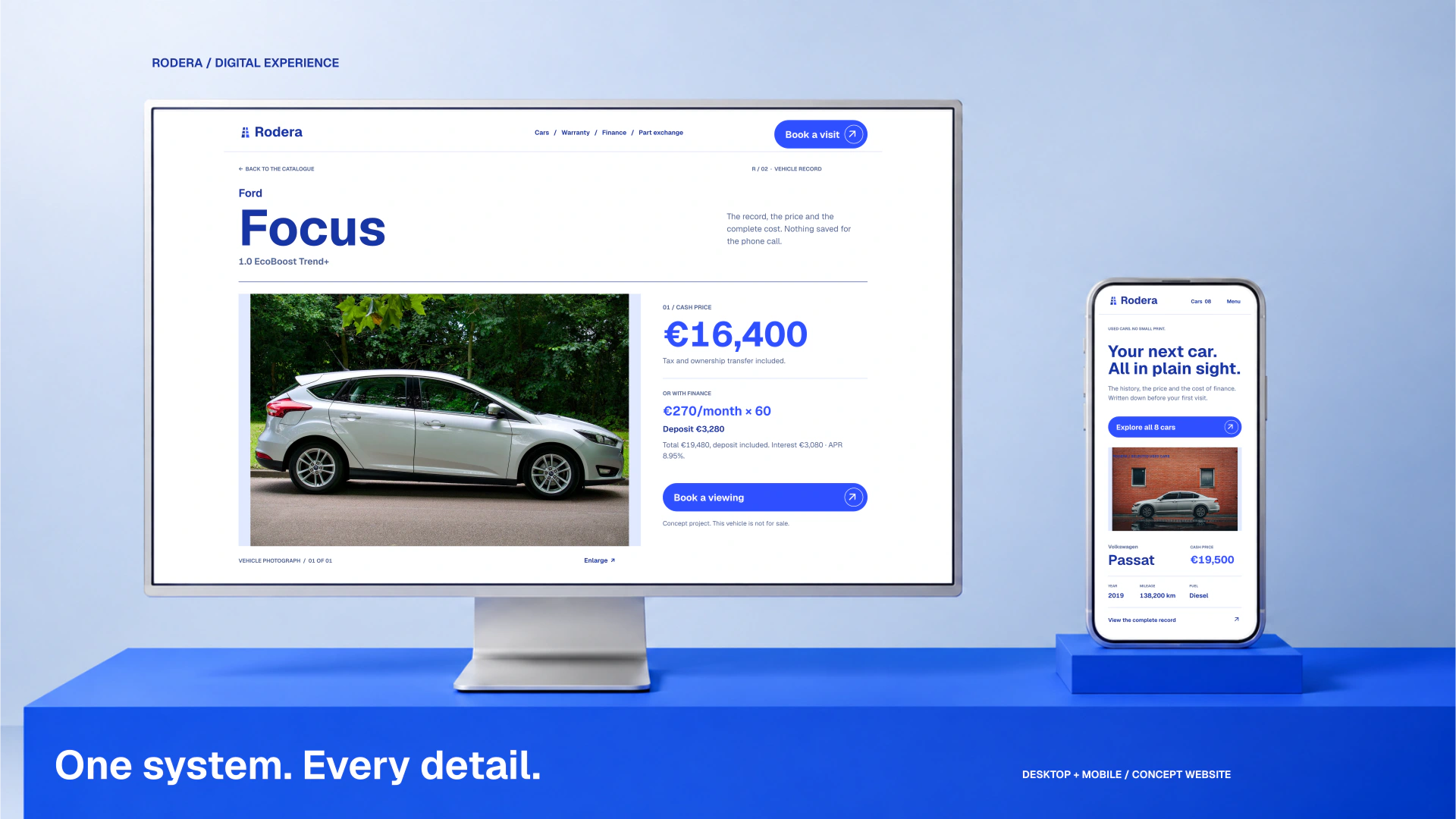
The vehicle detail moves from photograph and complete offer to specifications, declared history, finance and warranty. Reported repairs and servicing use the same weight and colour; they are not warnings, footnotes or accordion content.
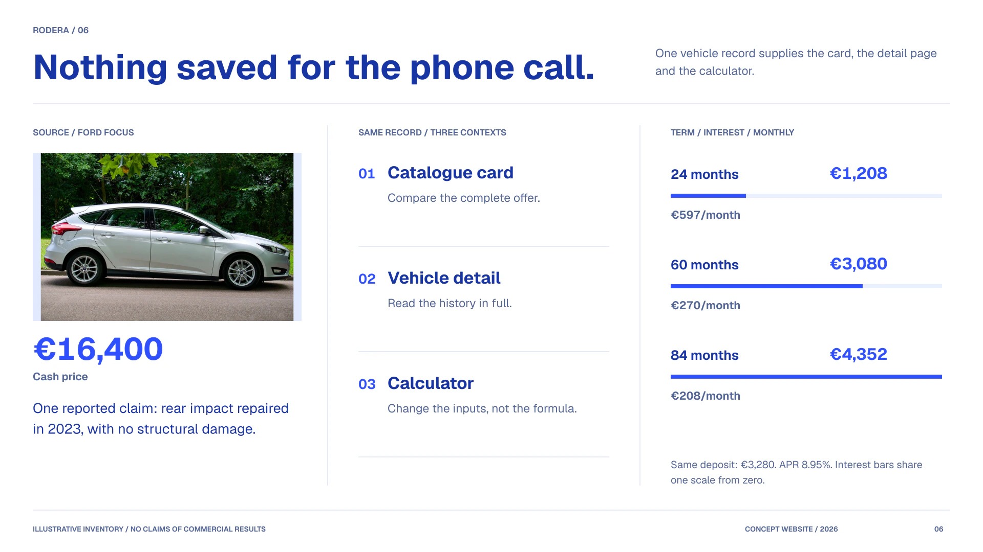
The calculator has its own space rather than a narrow sidebar. Deposit, term, monthly payment, APR, interest and total remain connected. The catalogue and calculator use the same formula, so the initial simulation matches the advertised demonstration offer.
The same record, at every scale
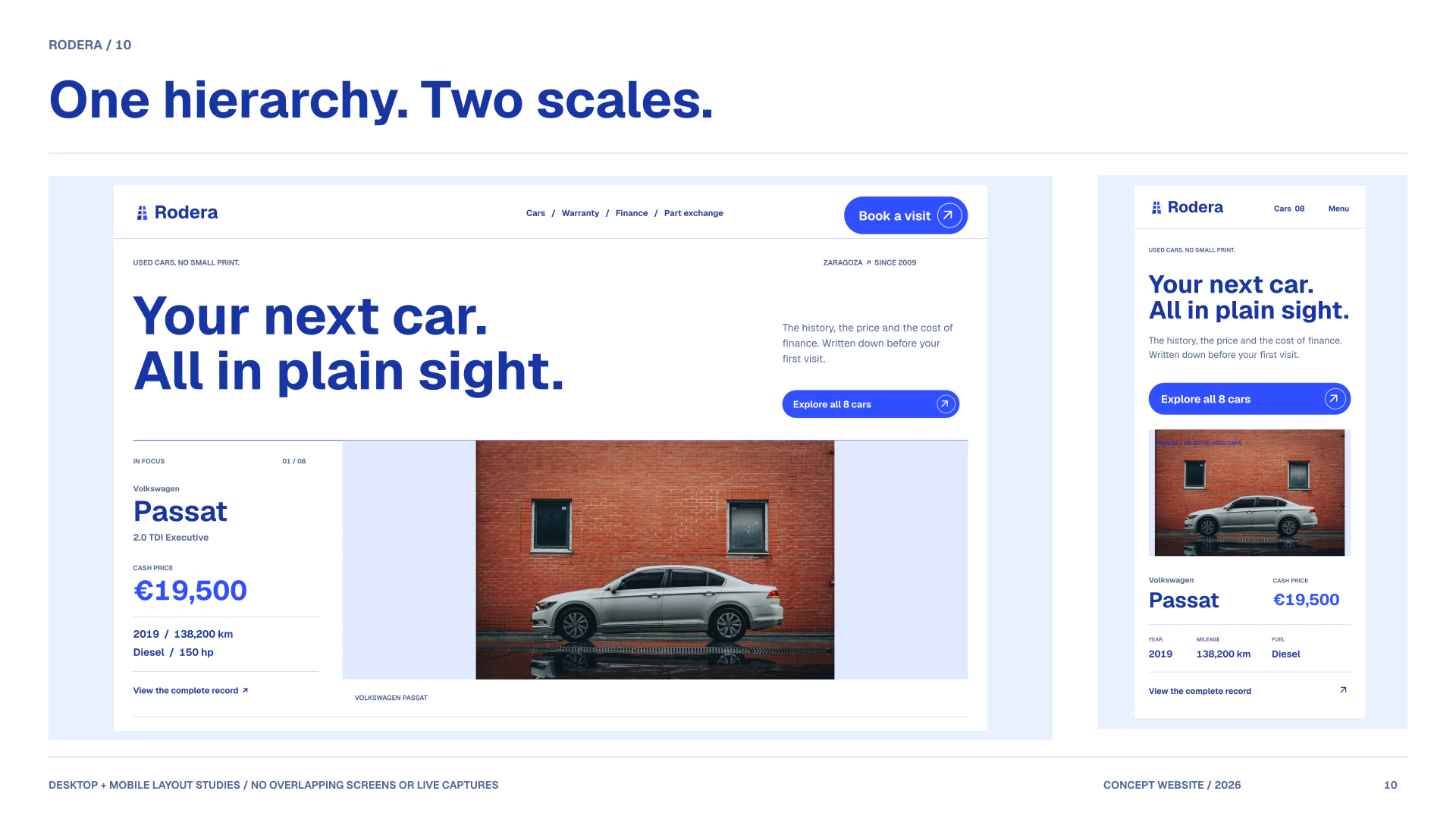
Wide layouts separate the photograph from the offer. On mobile, the content becomes a single reading column, with controls and disclosures kept in the flow. The catalogue stores filters in the URL, and the vehicle page retains its initial finance breakdown without JavaScript.
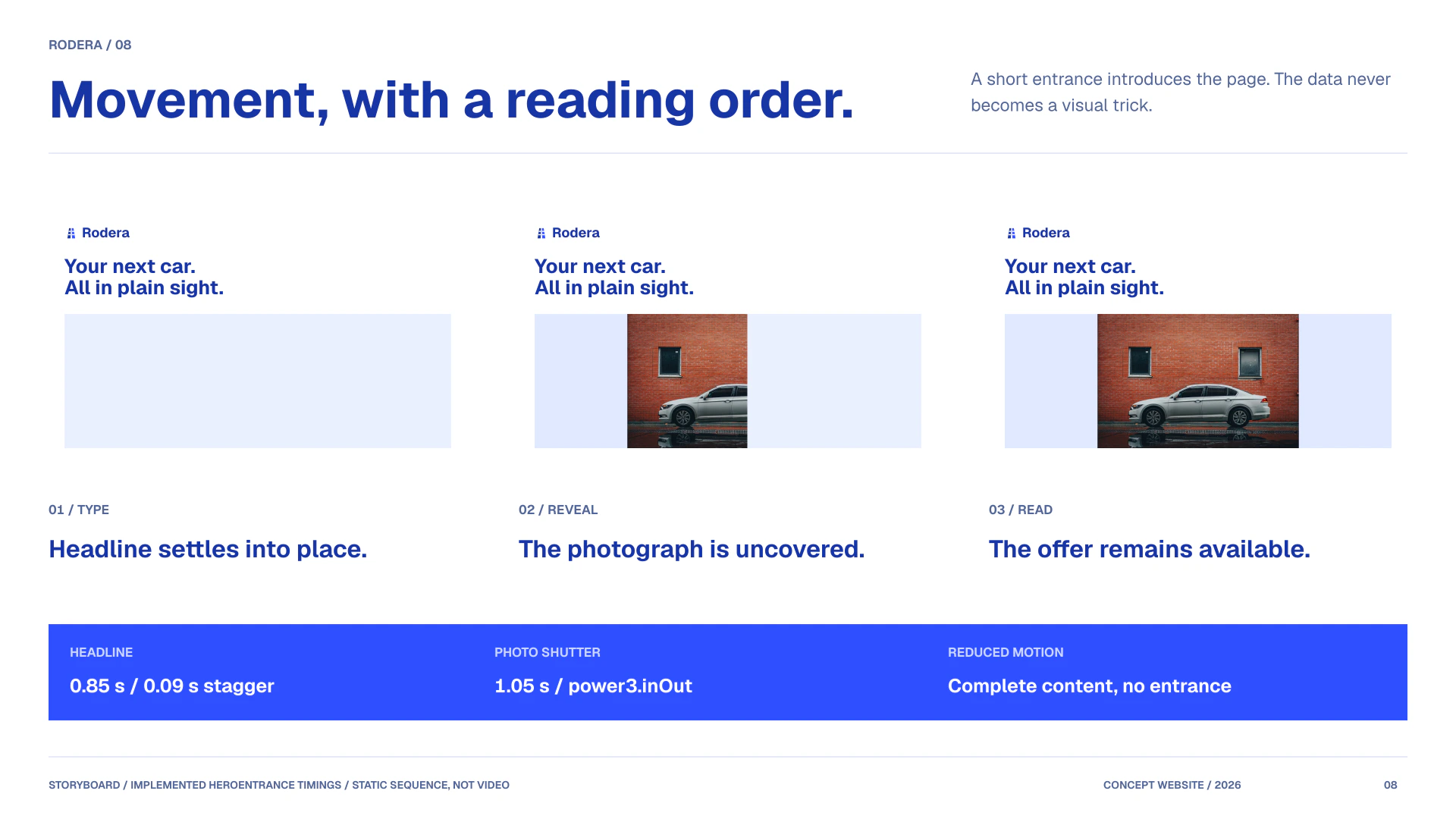
GSAP provides scoped entrances, a photographic reveal and scroll-led sequences with reduced-motion alternatives. The live conceptual website completes the presentation; this case does not claim measured conversion improvements or business results.
One hierarchy. Two scales.
English layout studies based on the redesigned code. Screens do not overlap; these static plates are not evidence of interactive or responsive QA.
Final presentation
AI-created studio environment with source-derived English interface compositions. Original vehicle photographs, typography and demonstration data are preserved.
Live result
Rodera