Editorial design system
Overview
Motion, radius and elevation tokens plus a set of interface primitives, built so a technical app reads like a publication.
Premise
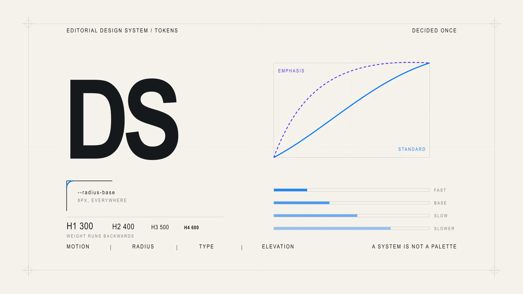
A system is not a colour palette. It is the set of decisions you do not have to make twice.
The diagnosis behind it was not a matter of taste but of absence: eleven different durations, three easing curves, six button recipes and four field recipes, each written at its point of use. None of that was wrong on its own. Together, it made a chip, a row and a nav link feel like three different products under the pointer.
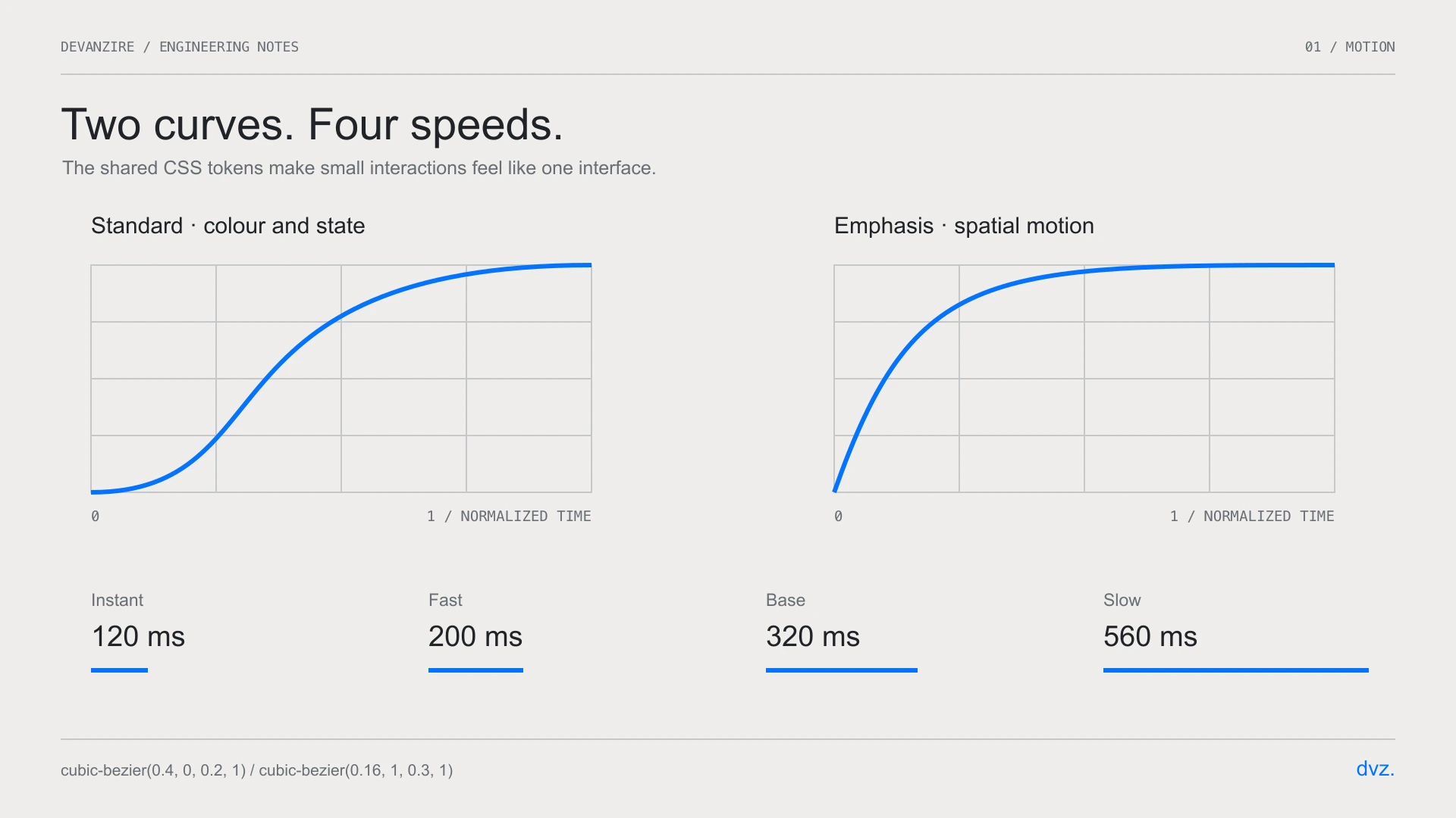
Two curves and four speeds
There are two curves because there are two kinds of change. standard for
whatever only changes colour, which has no inertia and should not pretend to.
emphasis for whatever moves, with a long tail so things settle rather than
stop.
There are four speeds: 120ms, 200ms, 320ms and 560ms. The numbers matter less than the fact that there are four of them and they have names. Eleven durations are not eleven decisions, they are none.
A single radius knob
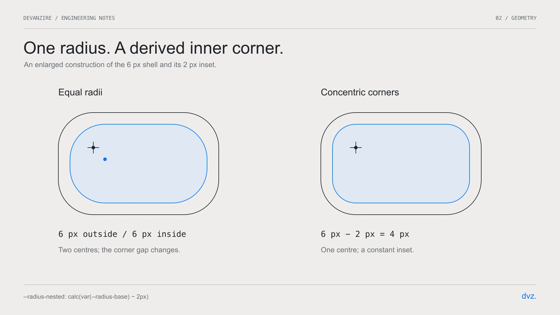
One value is written as a number, 6px, and everything else derives from it.
sm, md, lg and xl all point at the same one, which looks like a wasted
scale until you see the effect: there stop being components that disagree about
how rounded the product is.
The one exception is the one geometry demands. A box inside another box cannot
share its radius: for the two arcs to be concentric, the inner one has to be
tighter by exactly the padding. That is --radius-nested, and it is calculated,
not chosen.
Rhythm from margins, not \`gap\`
This is the decision that shows the most and takes the most arguing.
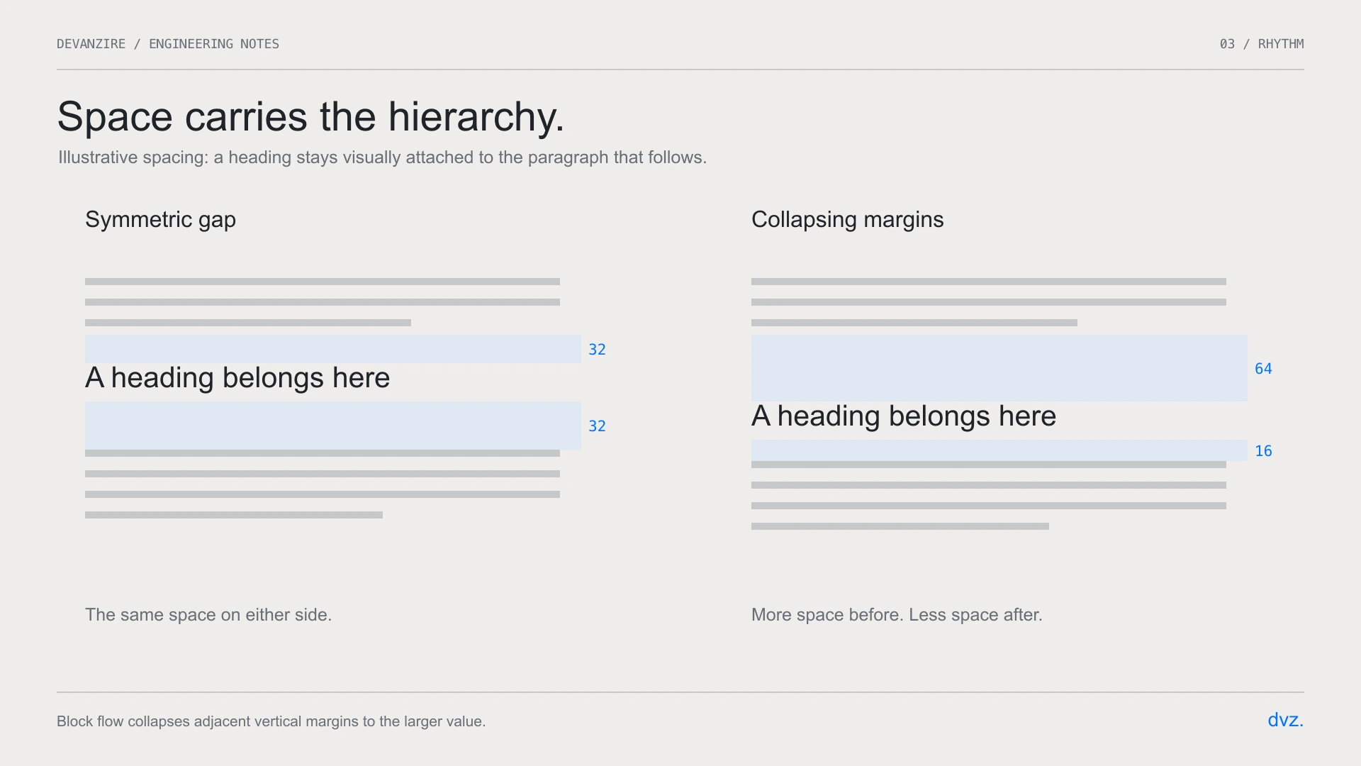
gap is symmetric by definition: it puts the same distance between every pair
of siblings. But prose does not have symmetric rhythm. The space above a heading
has to exceed the space below it, because the heading belongs to what comes
next, not to what just ended. With gap that is literally inexpressible.
With margins and vertical collapsing, each element declares its own air above and below, and the larger of two neighbours wins. It is the model word processors have always had, and it was abandoned for flexbox at a moment when nobody was setting long-form text.
What is left
It is in progress, and what is left is the boring part: documenting the form primitives, and deciding whether the elevation scale survives. Today it is two shadows per theme — light needs a cast shadow, dark needs depth without a grey halo — and I suspect two is one more than necessary.