Verdant
space to smile
Overview
A conceptual dental clinic where care begins with listening. A porcelain smile, soft greens and a sky-blue alternative shape an open reading experience, from exploring treatments to preparing a first visit.
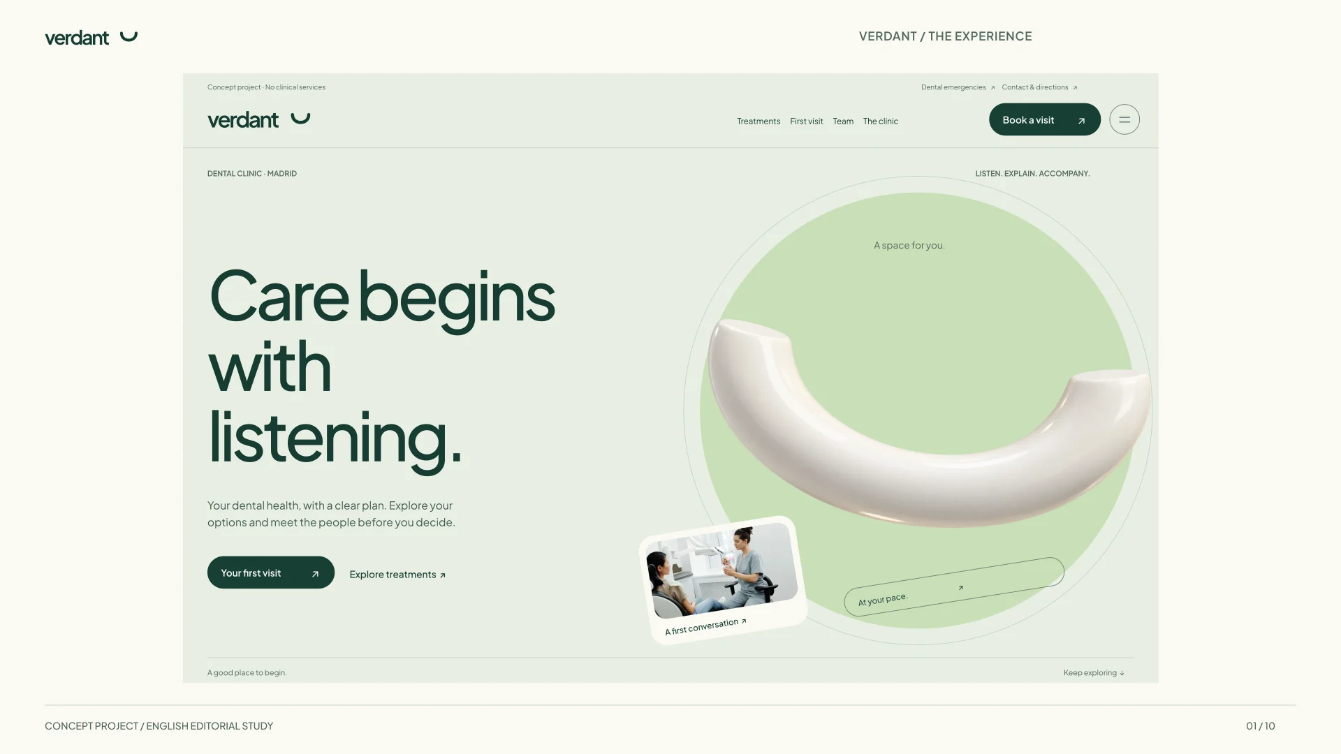
Care begins with listening
Verdant explores a warmer, considered approach to a dental website. Its composition rule —space to smile— becomes open headlines, curved surfaces and a reading rhythm that leaves room for questions. The project brings together art direction, interface design and frontend development across a multipage website.
It is a fictional clinic and an independent concept project. Treatments, team and care journey are demonstration content; the website provides no clinical services or real appointment booking.
An open first impression
English editorial adaptation based on the redesigned source. These plates are authored interface studies, not screenshots of a translated application or evidence of its behaviour.
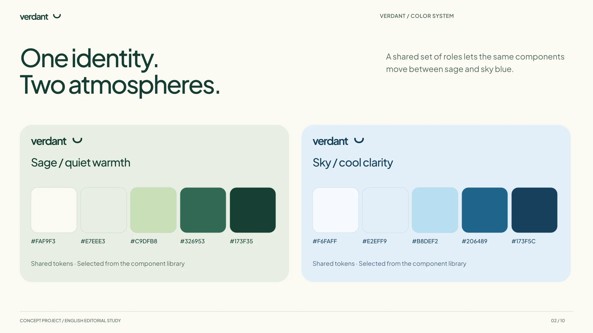
One identity, two atmospheres
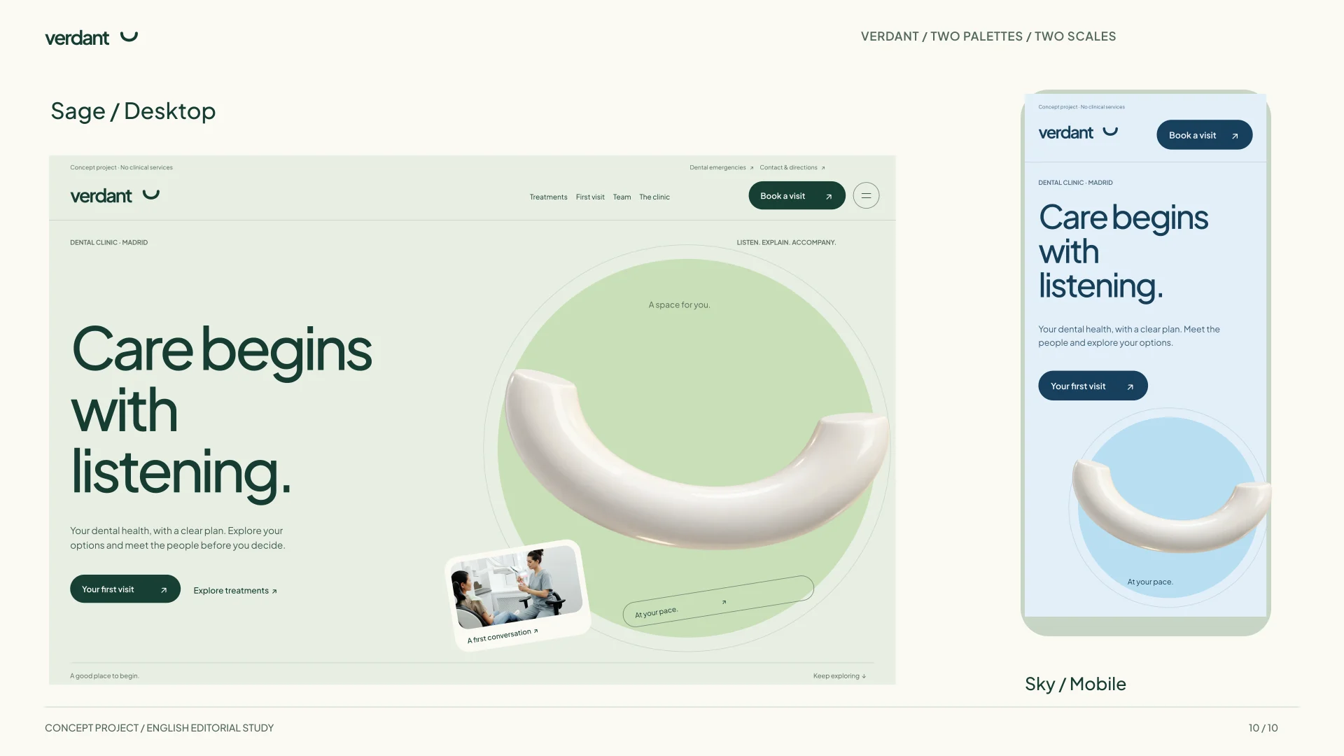
Sage, ivory and deep green ink form the main palette. A second direction translates the same roles into sky blue and darker blue ink. Both share the same components and can be compared in the internal library; changing the palette does not duplicate pages or content.
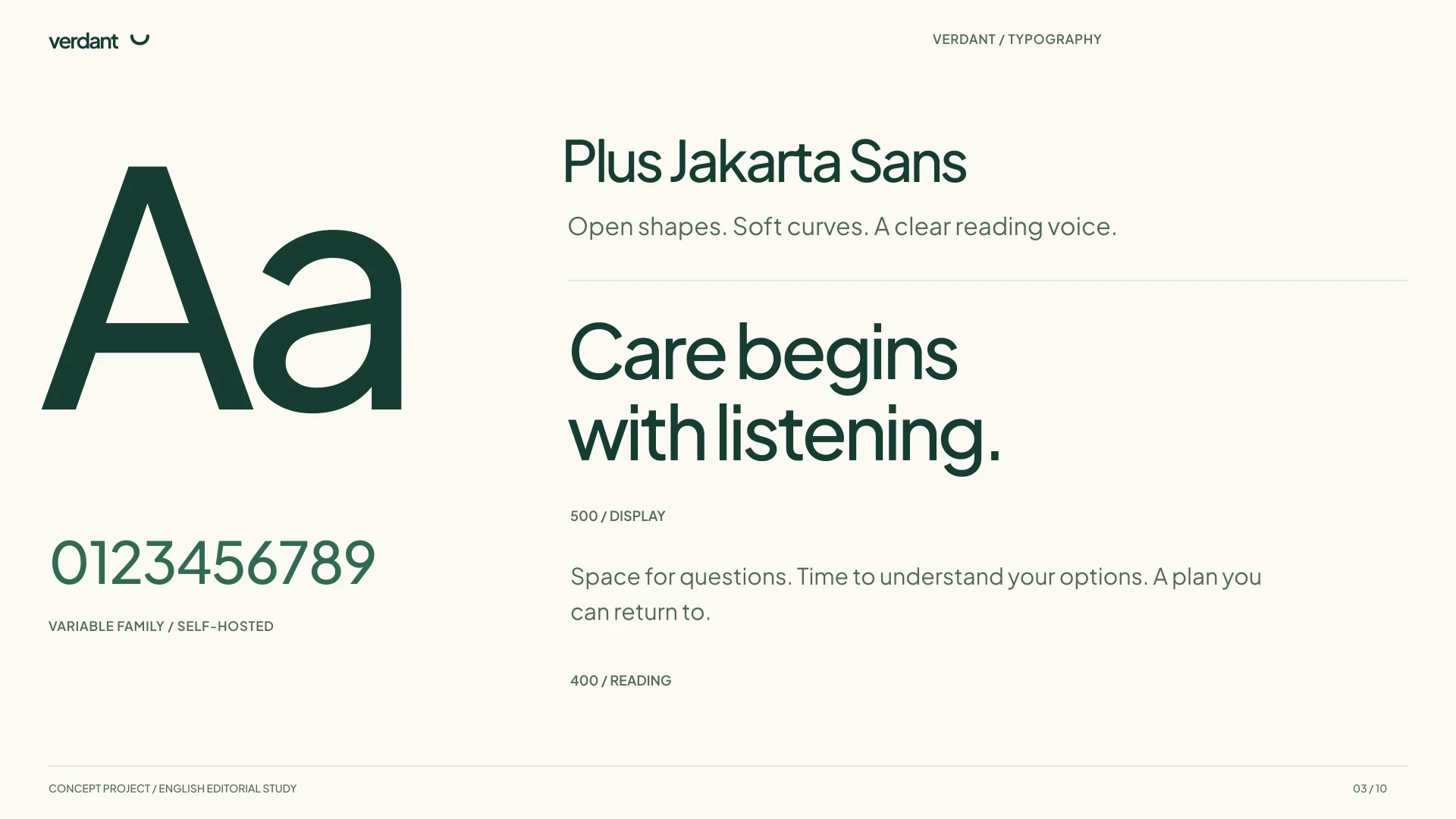
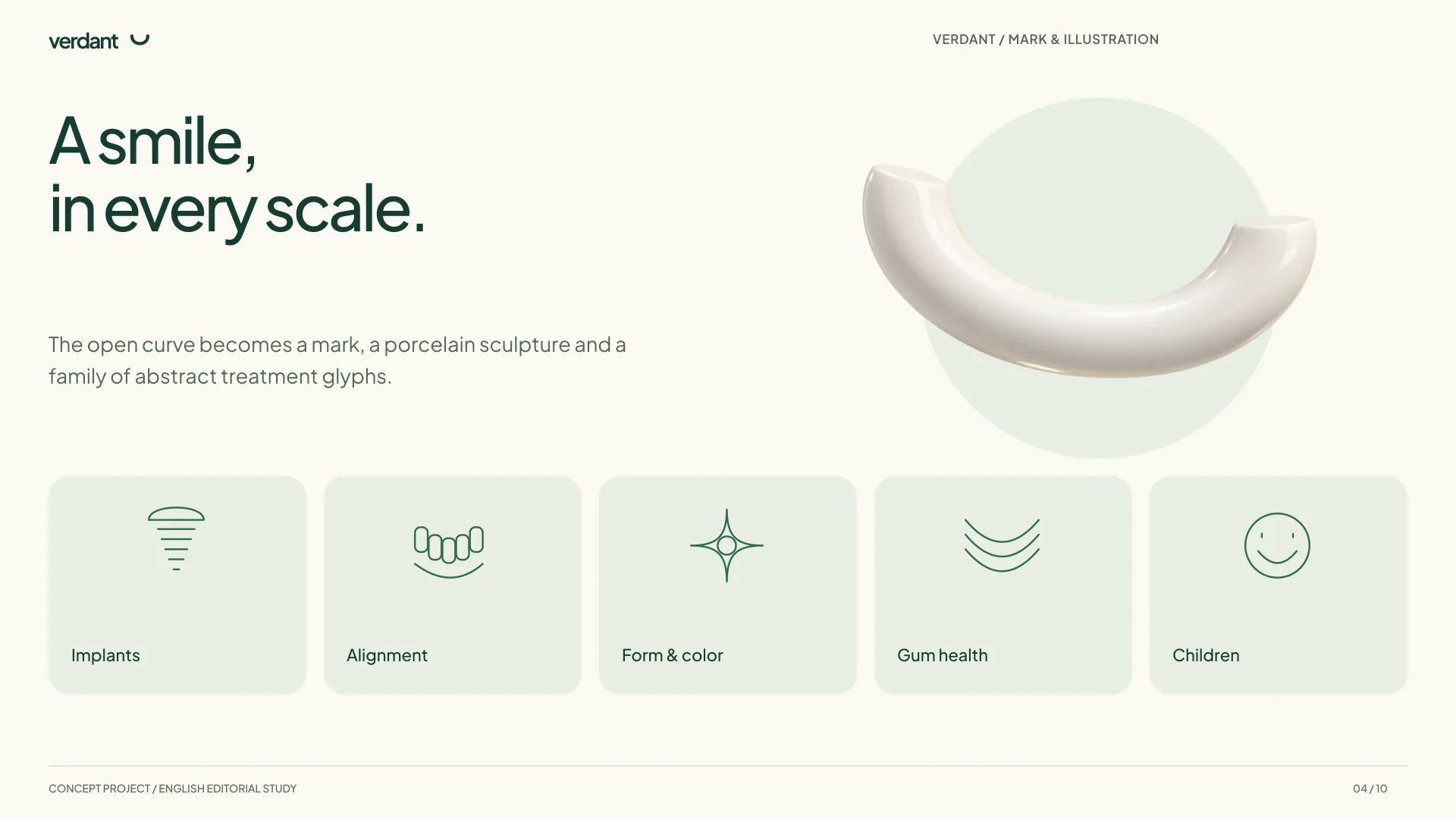
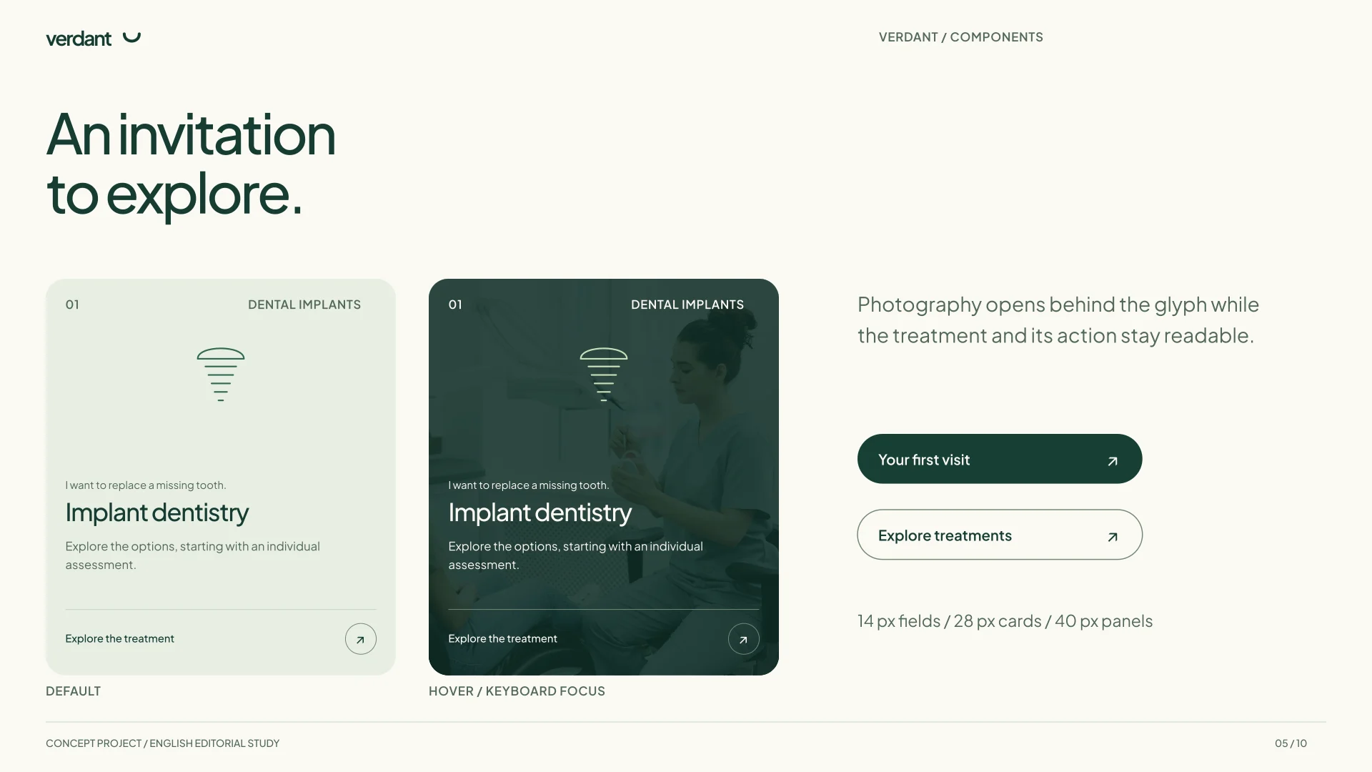
Plus Jakarta Sans brings open curves and a consistent voice across display type, reading and controls. The smile becomes a vector mark, a porcelain sculpture and a family of abstract treatment glyphs. A 14, 28 and 40-pixel radius scale organises fields, cards and panels.
The visual system
Seven design plates: palettes, typography, identity, components, care journey, photography and motion. All text inside the images is in English; the case itself is available in both languages.
Understand first. Decide next.
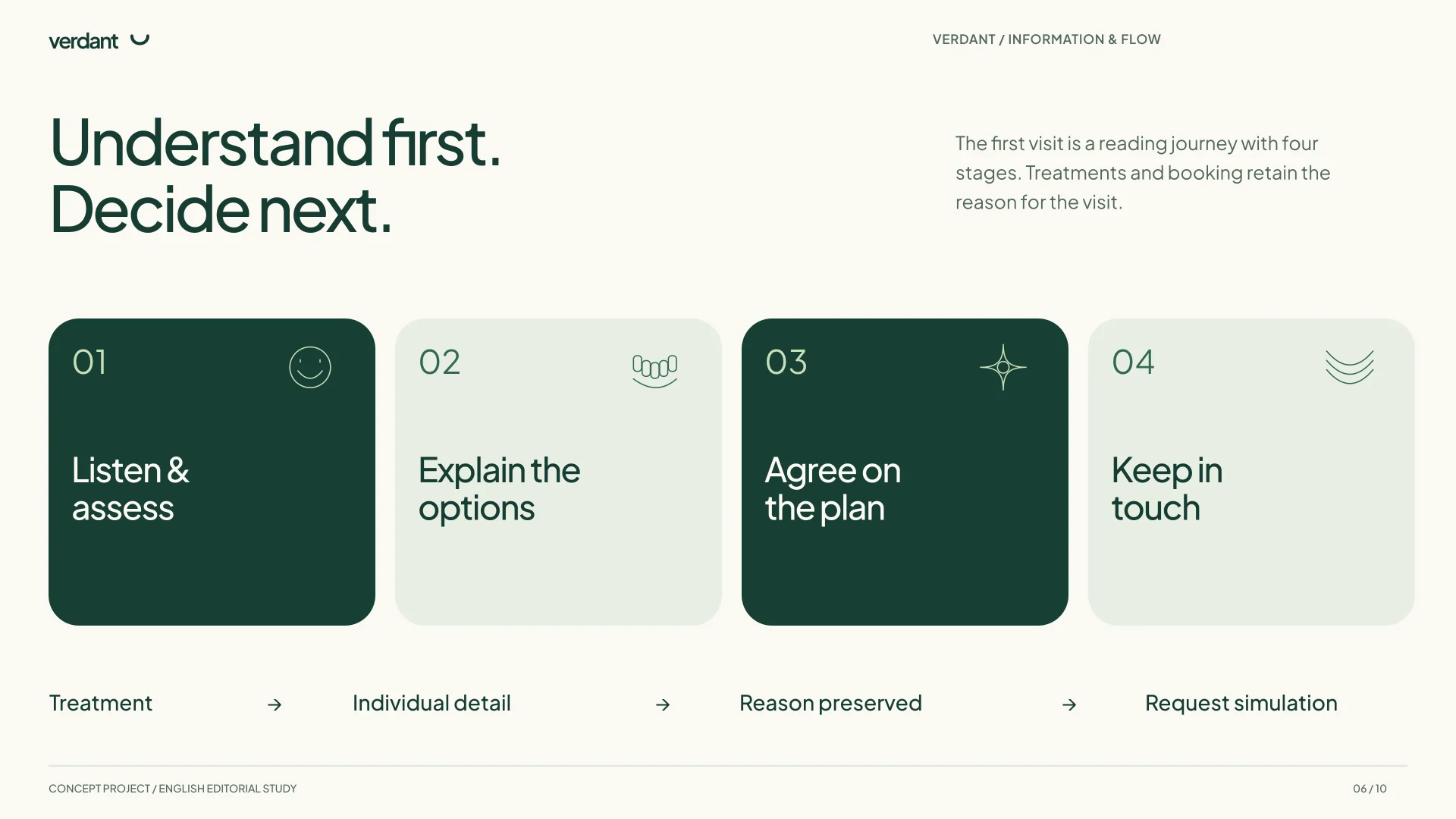
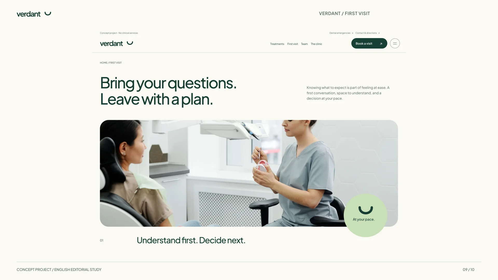
The first visit has a journey of its own: listen and assess, explain the options, agree on a plan and follow up. On desktop, a pinned image sequence accompanies the four steps. On mobile, the content continues in a normal reading column.
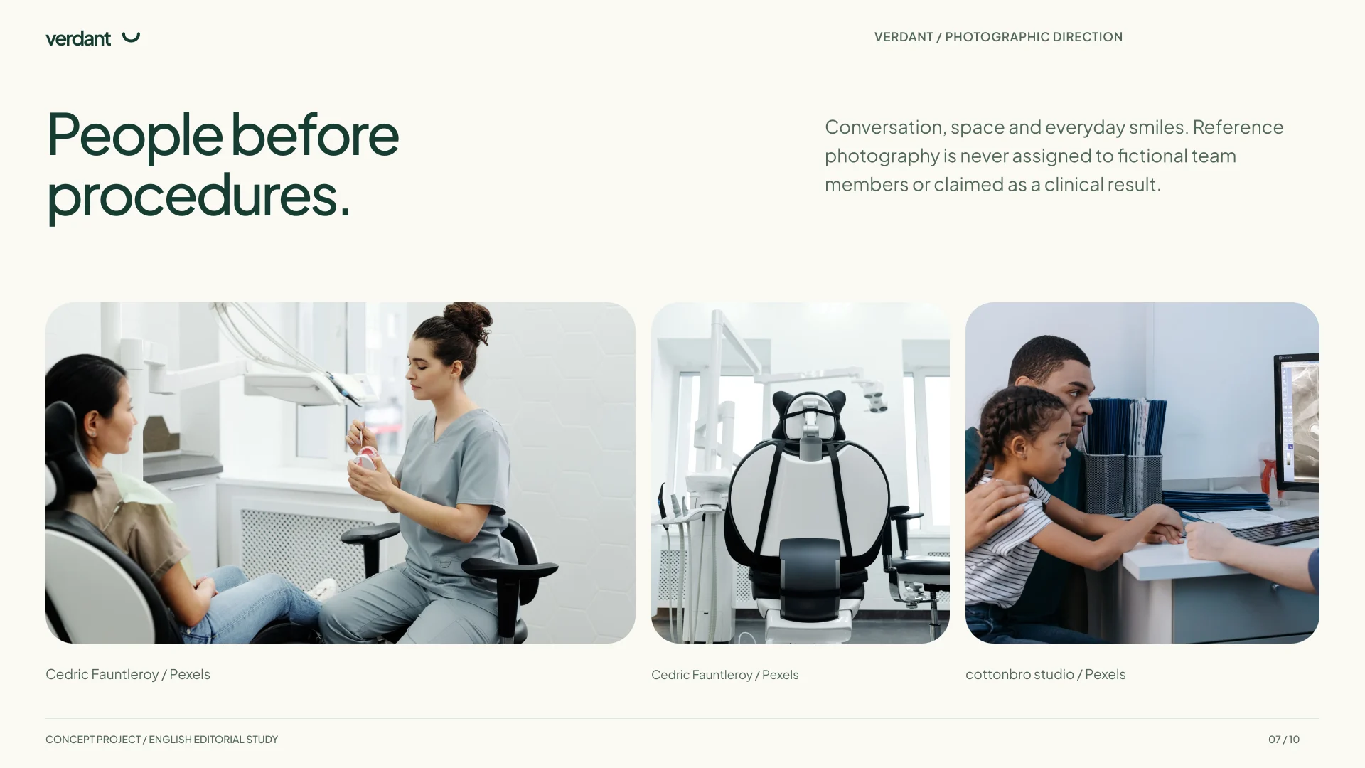
Treatment pages explain what can be discussed before carrying the chosen reason into the form. The request is an explicit simulation: it validates fields in the browser, but sends or stores no data and confirms no appointment. Photography sets the atmosphere of space and conversation; it is not assigned to fictional professionals or presented as clinical results.
A space for the first visit
Editorial study of the first-visit page, with reference photography and the brand seal.
Motion that follows the reading
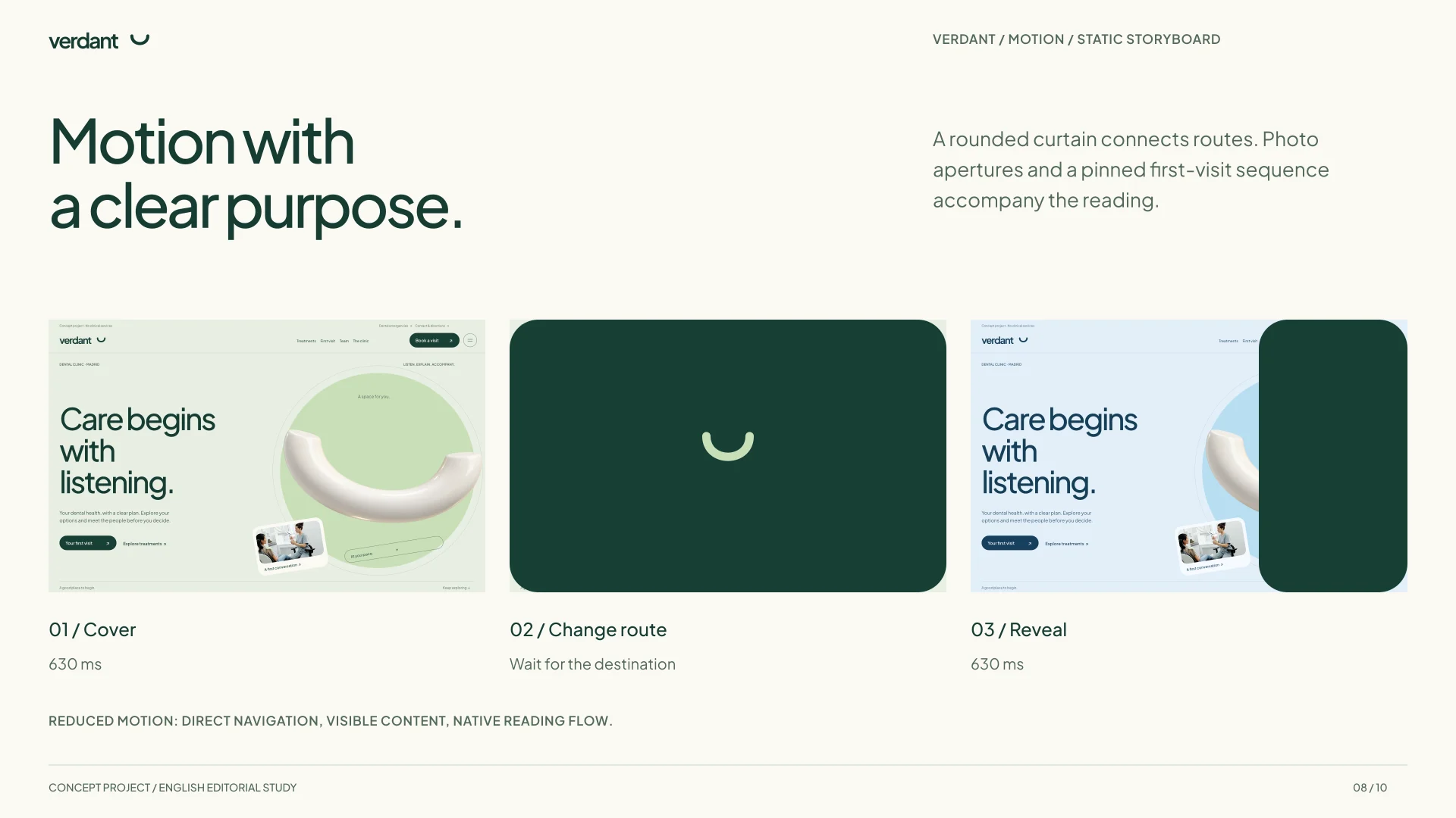
The header shares the hero background and becomes compact as the page scrolls. A rounded curtain connects routes, while treatment cards reveal photography on hover or keyboard focus. Image apertures and the first-visit sequence use GSAP and ScrollTrigger with cleanup on navigation.
Reduced motion removes the curtain, displacement and pinning. Content stays visible and scrolling remains native. The internal library reviews sections and palettes using the same components as the site.
Two palettes, one hierarchy
Separate desktop and mobile studies. The comparison shows composition decisions; it does not replace responsive testing of the application.
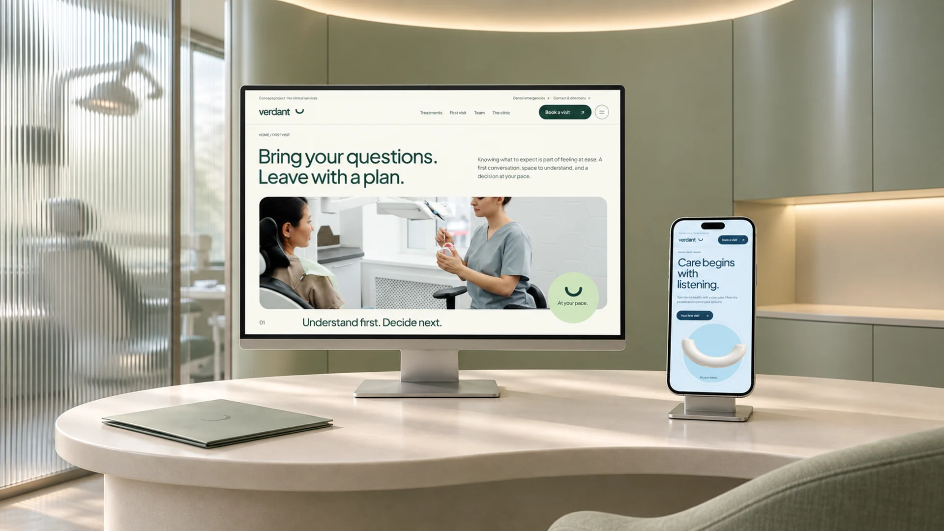
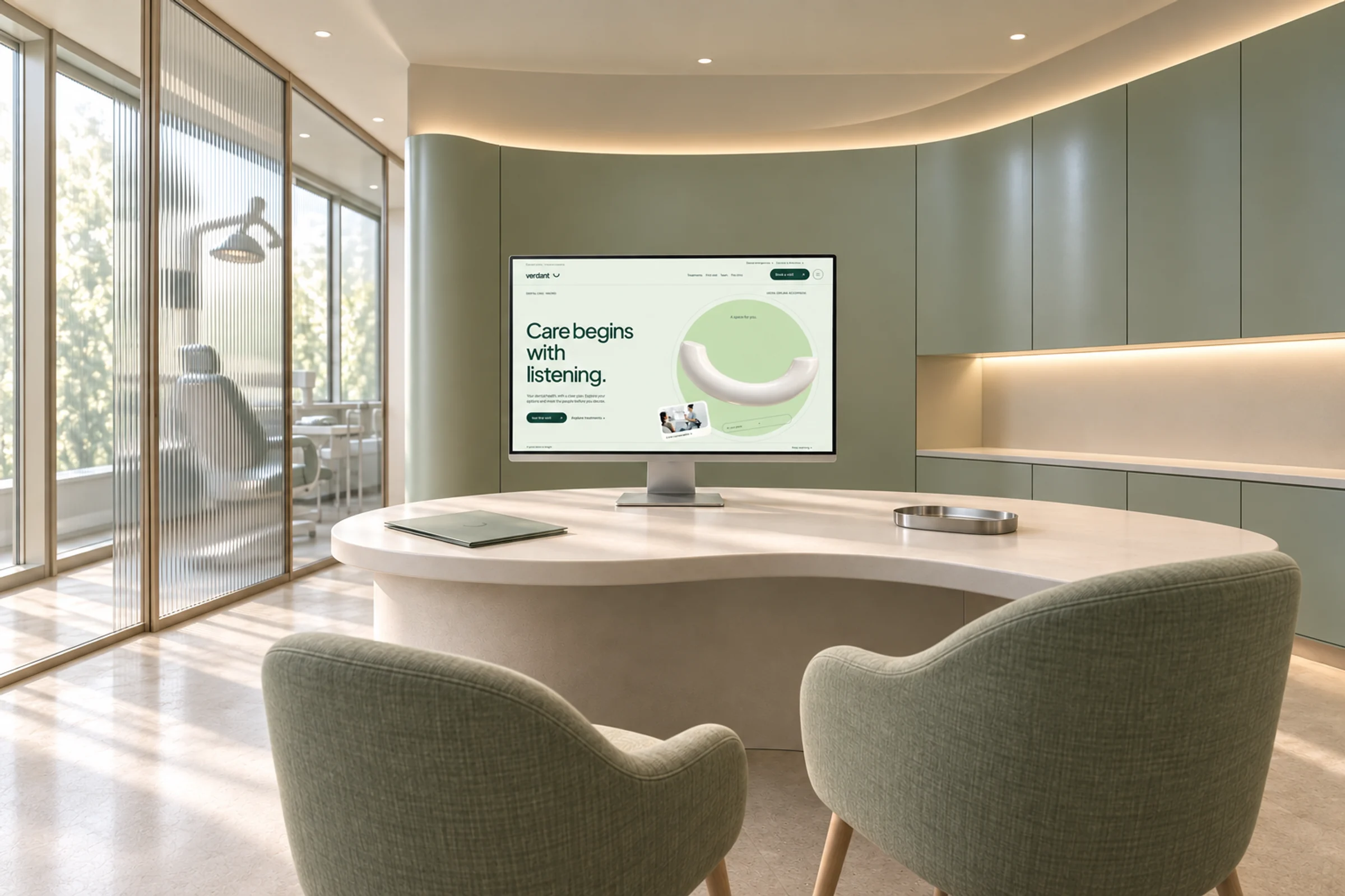
A considered first step
AI-generated illustrative mockup based on the English interface studies. A conceptual consultation space presenting both palettes.